

Visme Reviews & Product Details
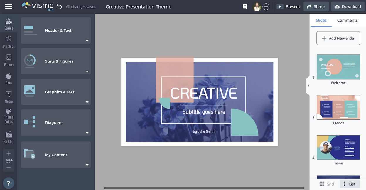
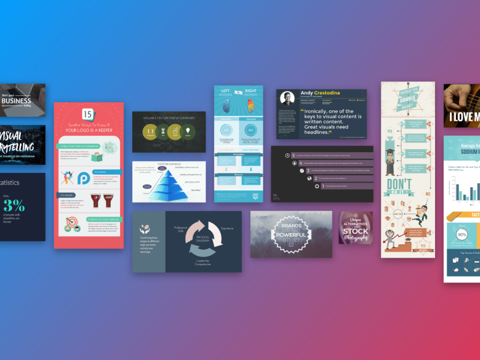
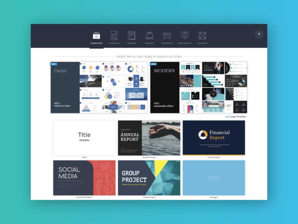
Visme is a comprehensive online graphic design software that’s perfect for creating visuals for presentations. It lets users create charts and infographics, social media content, and digital artwork, even with little design experience. The platform is simple to use, user-friendly, and intuitive, and provides users great guidance as they attempt to create their designs. You get access to numerous templates that simplifies creation and templates are also categorized by industry. Visme’s real-time collaboration features are also notable, making it perfect for teams.


| Segment |
|
|---|---|
| Deployment | Cloud / SaaS / Web-Based |
| Support | 24/7 (Live rep), Chat, Email/Help Desk, FAQs/Forum, Knowledge Base, Phone Support |
| Training | Documentation |
| Languages | English |
Visme Pros and Cons
- Easy to use
- Wide variety of features and templates
- Great for creating visual presentations that stand out
- Slightly more expensive than other online graphic design tools
- Lower-priced plans are a bit restrictive
- Does not support guest collaborators

I really enjoy using Visme as it's super clear, easy to navigate and has all the features necessary to meet the demands of a small business owner! The templates are great and the presentations look amazing!
I've been using Visme for the past 2 years now and I can't say anything bad! I think you get used to it extremely quickly!
I use Visme strictly for presentations - they're always eye pleasing and all of my clients really enjoy them!
We implemented Visme a few years ago and it was the best decision ever! It's super easy to use with a lot of great features perfect for a marketing agency - creating presentations for clients, content creation and video editing have never been easier! Also the customer support is great, always ready to help.
To be honest I can't find a thing - after a few days I was completely introduced to Visme and working there was very easy from the beginning.
The libraries of templates and other elements are really helpful - they're very appropriate for the business setting and with their use you can minimize the time you spend on creating your custom designs.
I use Visme for basic data visualisation - I really like all of the charts, the fonts and how you can create your own dashboard! It's super easy to use with a lot of great features, that can be beneficial also in reporting!
I can't see any - I really like Visme and I feel like it's great for both beginners and advanced users!
Visme helps in creating great dashboards - either from the templates or by creating a custom one yourself! The data is really well presented and everybody loves the reports!
As a content creator and editor, I really like Visme! It has all necessary features that allow you to create plenty of engaging content! I've been using it everyday for the past year and I must say - it was super easy to implement it into our department!
So far I can't say much about disadvantages of Visme - the platform is great when you include its price!
The templates are great, there's a lot of features enabling editing videos and photos, which makes my job a lot easier - I don't neet to run between platforms to get the job done!
I'm a graphic designer and I use Visme every day - it's an incredibly easy to use plaftorm which offers great features for a great price. There's plenty of interesting and not so usual fonts, which helps immensly in creating engaging content. It's probably my favorite feature!
So far I haven't seen any flaws - I feel like the platform is very diverse and has everything you need.
Speeding-up the design process, offering pleny of different fonts and stock materials, great templates.
I've been using Visme everyday for the past 2 years for content creation. As a social media specialist I really value a wide portfolio of templates, graphics, charts etc. Visme is super easy to use, very intuitional and has amazing features.
At first it was hard for me to switch to Visme, as I've been using different platforms, but after a week I felt really comfortable! Can't find any disadvantages!
Great templates, amazing stocks, a lot of different fonts and super user-friendly - I've been able to speed-up my work significantly with Visme!
I've been using Visme for content creation, ads, banners and all marketing-related stuff. I feel that it's super easy to use, the library is full of great quality content and the templates are really professional.
At first I had some issues with moving the elements, but after a few days I no longer had any problems! I guess you just have to get used to it!
Visme helps in making the whole process of graphic design a lot easier and faster.
Ele é uma plataforma que faltava no meu dia a dia, pois consigo saur inumeros elementos que ele tem para meu trabalho e estudos. Tem um design moderno e os criativos são muito profissionais
Nao tem nada que eu nao goste. Todas as funcionalidades são bem interessantes
Esta acelerando meu processo de criaçao
Everything... I was not an early adapter to Canva, so I adopted VISME early on and love the old and expanded tools!
There is nothing that I dislike about teh software.
Super quick to edit and and I LOVE the new "Color Match" to website feature that will auto popuate. On another note , I have a concept that would require programming for the POD (Print on Demand) industry that NOBODY has. It could possible be an "ADD ON" or a NEW business for you?
Provides a lot of flexibility in terms of content and templates provided.
Not really anything I can think of, once you have used Visme quite a bit its really easy to use.
Giving flexibility and an array of content creation options, as well as predefined templates to get the creative thought process moving forward
Learning Visme was easy, there were a variety of templates and the template I chose was easy to modify. I reviewed a number of options to create an eBook and Visme seemed like the best option. I'm happy with my choice. I used the free product through the development of the eBook and then switched to the paid version when I needed to download the book for distribution.
Perhaps I didn't spend enough time digging into the details, but I had a relatively hard time placing objects exactly on the page. Also, I had an issue with text on the right side of the left hand page of my book being cut off. It's as if they had sewn the pages of the book together without informing me I needed to leave a gutter.
I used Visme to create an eBook for marketing purposes. My project was successful and I'm happy with the result.
It is having creative templetes for creating any graphical information with high quality visual effects also it has made me expert in me in creating impactful presentation and its easy to use .
It is very useful for entrepreneurs and organization but iT is little costly as an individual. It has collaboration facilities but it's limited as well ineed to provide more space to store presentation
i prepare my projects my presentations with the help of readymade templates which save my time of making graphics and design for presentation also I pre scheduleb my presentation with the help of this application.
It is simple, and have a most amazing content.
I wish to have even more content sometimes you just need someting extra.
It is so easy to make some incredible content.
I like how it is so user friendly. It also is able to have better designs.
The menu on the left side could be redesigned
It gives the best design and the ease of use it has.
I started using the Visme free version several years ago when a university lecturer recommended it during a course. It was so good, I convinced my company to buy a subscription and have continued to use it ever since! It's very easy to use but also offers some great free, online training courses to learn about existing and new features. The thing I like best is the continual improvement. The Visme team really do listen when you ask them to consider improvements to features - I once asked for a new type of shading on some of their graphics and literally 2 months later, it was introduced - where else can you get that?!! They also offer beta testing to frequent users when bringing out new features. I have used Visme to develop a host of graphics and animations, including infographics, web banners, concept pieces, training materials, presentations, videos, procedures, templates and printed materials and have had a really positive experience. I have recommended Visme regularly to friends and colleagues.
No dislikes or issues. Where I have felt in the past that something needed changing, Visme's collaborative approach with their users meant that fixes were introduced.
The wide utility offered by Visme means that I can quickly create great looking pieces within minimum fuss, to address a broad number of business needs.
I've had a few problems getting things to export correctly but their support team responded immediately and kept following up with my issues.
There have been a few instances where exporting or downloading a file has taken quite a long time to happen.
Visme allows me to quickly create customized animated visuals to make our products have a more professional look at a fraction of the time.
The ease at which you can create new content, the templates, the fact that when you change one library slide, they all update. Using brand colours and easily applying these to all presentation. That you can customise the graphics.
I would like better transitions between slides in presentations, so rather than moving through the slides in order, like you would if using PowerPoint, to make it more exciting and maybe having buttons which mve you around different pages.
Creating colourful, engaging content for our audience, which is mostly made up of secondary school children
Ease of use. Ease of Implementation. Flexibility. Pricing. Quality Product. Innovation. Customer Support. Learning Materials. Speed of Production.
I really have nothing to say or dislike. I know they are constantly working hard to provide new features and more powerful design elements, I look forward each month to seeing updates from Visme.
Visme solves many problems and unlocks so many possibilities for me. I don't have to spend a fortune with creative design agencies. I don't have to wait for months to receive one piece of finished content. I don't have to spend valuable time on calls to request changes. I don't have to be limited in what I want my content to do by a designer. I don't have to spend weeks of time lost in implementation and debrief calls or vendor set up like I have experienced with design agencies, setting up on Visme took place in minutes! I can easily and quickly share the content I want to with whover I need to. I can create literally any type of design or content in minutes. I can increase the scale and create a multidude of documents in minutes. I can easily apply my company branding and don't have to do it manually. I can pick out out of the thousands of ready made template and tailor as fit. I can envision Learning & Development, Training and Support reaching the highest levels of service and quality at my company now, for my people. I can rely on hundreds of tutorials, webinars and materials provided by Visme on a regular basis for guidance, not wait around for a designer. I can integrate with a great deal of powerful apps: Loom for example. I can look forward with excitement each month to new features, new lessons and tips/pointers from Visme, which a design agency simply will not provide or cater for.
It's so easy to use and it has some great interactive features that really make our projects stand out.
I have nothing that I dislike about Visme.
I can create personalized presentations that are on brand in no time without having any design background or knowledge. There's a template for everything you can imagine :)
The AI tool and photo depository are helpful with creating dynamic presentations and documents. Our team uses the software daily, with its shared workspaces, it makes collaborating on a project easy. Merging workplaces made implementation difficult in the beginning, but customer support was very responsive and helped clear up the billing issue quickly.
Sometimes moving copying and pasting graphics can be difficult, and when sourcing past graphic you have to scroll forever to find it. A folder/organizer tool for photos would solve this integration problem.
Creasing unique, visually appealing presentation quickly was a bottleneck that visme has been a great solution for.


